


We thought we were done with our recent stream on crude oil prices, consumer confidence, and their impact on bond yields, but the graph below and analysis from a client of ours is a great encore to the recent commentaries (LINK LINK). Our first commentary stated:
“While we understand the fear, the reality is that the market is not pricing in future inflation in line with the market reaction. The extra yield, known as the term premium, will likely normalize when oil prices fall and inflation expectations cool.”
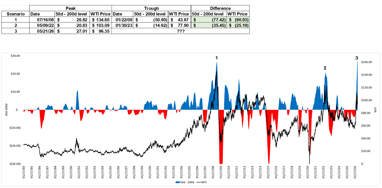
We presume many people read it and asked, ‘when?’ To guide us, the graph and table show the three most pronounced surges in oil prices over the last 40 years. The momentum in the two prior surges was literally off the charts, as measured by the difference between the 50- and 200-day moving averages of oil prices. The moving average differential is shown in blue and red. Today, the 50-day moving average of crude oil is $27.01 above its 200-day moving average, the largest gap since 1984.
In 2022 and in 2008, the moving average divergence reversed drastically after peaking. As our client wrote:
You will notice that in both prior scenarios, we not only witnessed a dramatic pullback in the 50dma-200dma spread (eventually forming a Death Cross) but also saw a substantial decrease in WTI crude prices.
It’s possible that tensions with Iran persist, and crude oil prices remain high. Such an outcome would allow the 200-day moving average to catch up to the 50-day moving average without a significant decline in oil prices. However, if this moving-average divergence peaks with a US-Iran agreement and oil flowing freely, the odds favor price declines more akin to those in 2022 and 2008. Given the strong correlation between oil prices and CPI, the type of normalization could profoundly reduce CPI and, with it, sharply reduce bond yields.
What To Watch Today
Earnings
- No notable earnings releases today
Economy

Market Trading Update
Yesterday, we discussed “what potentially breaks” the rally. However, the real question is what breaks Technology and Semiconductors, which have been the majority of the rally over the last few weeks. The chart of the day says everything. The chart of the day says everything. The VanEck Semiconductor ETF (SMH) closed Tuesday at $596.94, while its 50-month moving average sits at $222.30. That puts the fund 168% above the trend-following line that has tracked the sector cleanly through every cycle since 2002. The parabolic semiconductor rally has reached the kind of technical extreme that historically marks the back end of cycles, not the middle.
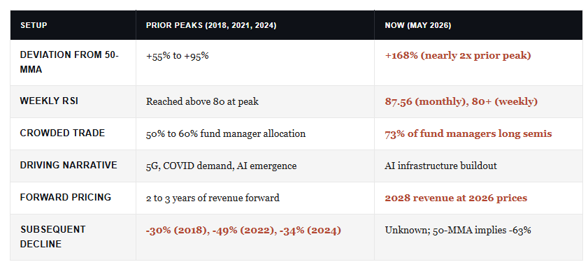
In addition, Bank of America’s technical desk just flagged the weekly RSI above 80 for the second straight week. According to their work, that’s an all-time high reading and only the fifth such instance since 2012. The signal matters because it doesn’t appear in healthy uptrends. It appears at the back end of them.
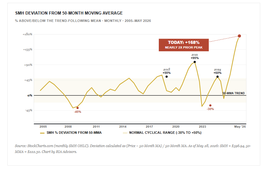
The 50-month moving average is the trend. Notice in the chart below how cleanly the 50-MMA has tracked SMH through every cycle since 2002. Each prior overshoot, in 2018, 2021, and 2024, mean-reverted back toward that 50-MMA line within 12 to 24 months. That’s the line worth watching. For context, the prior cyclical peaks ran roughly 50% to 95% above the 50-MMA. The current reading nearly doubles the previous record high, set in early 2022.
Of course, that parabolic shape is not opinion. It is the literal geometry of a price series accelerating away from every reasonable mean. Importantly, parabolic moves do not unwind through gentle consolidation. They unwind through air pockets because the marginal buyer has already bought.
What Breaks A Parabolic Semiconductor Rally
Yesterday’s commentary outlined what could break the broader market. The semiconductor rally has its own specific breaking points, and we’re watching all three in real time.
- First, hyperscaler capex discipline. The entire AI infrastructure thesis depends on five names underwriting the buildout: Microsoft, Meta, Amazon, Google, and Oracle. Their combined capital expenditure is projected to run north of $800 billion next year, and the semiconductor complex is priced for that number to keep rising into 2028. The moment any one of them tempers forward guidance, the bid under Nvidia, Broadcom, and the rest of the SMH basket evaporates. Customer concentration is the soft underbelly nobody discusses.
- Second, positioning. Bank of America’s May Global Fund Manager Survey identified “long global semiconductors” as the most crowded trade on Wall Street at a record 73% reading. When 73% of professional money managers sit on the same side, the marginal buyer is already in the trade. Therefore, there is no second leg of buyers waiting to bid on the dip.
- Third, valuation gravity. Semis are currently pricing 2028 revenue at 2026 prices. We’ve seen this exact setup before. The 2000 dot-com peak. Then the 2018 cycle top. And again at the 2021 peak. Each time, the rally was justified by a “different this time” narrative. Each time, forward multiples mean-reverted faster than analysts updated their models. The current setup is not new.
Bank of America studied seven prior episodes where the SOX index or SMH saw the weekly RSI cross above 80. The years are 1995, 1997, 2000, 2012, 2014, 2017, and 2024. The aftermath ranged from a sharp short-term pullback to the 82% drawdown that followed the 2000 dot-com peak. SMH’s own max drawdown from inception is 90.52%, set in November 2008. Recovery from that low took roughly nine years.
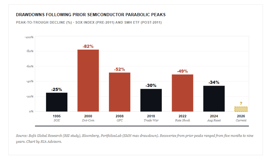
One pattern holds across every entry on the chart. In every downturn, the semiconductor index drops harder and faster than the S&P 500. For example, in 2022, SOXX fell 35% on a calendar-year basis while the S&P 500 dropped roughly 18%.[4] The sector’s higher beta cuts both ways. It amplifies gains during accumulation and amplifies losses during distribution. Today, with the trade this crowded and the technicals this extreme, the probability of a sharp distribution event is materially higher than at any point in the cycle so far.
- Consider trimming winners back to portfolio weight. If a position has grown to twice its target weight, take it back to the model. Rebalancing forces profit-taking instead of riding the position back down.
- Second, tighten trailing stops. Use the 10-month moving average as a working stop, since that line has historically caught early breaks in the trend before the 50-MMA mean reversion completes.
- Finally, cap sector concentration. We’ve trimmed aggressively as this move accelerated, and we continue to hold meaningful exposure. Holding and trimming are not opposites. They’re the same discipline applied at different price points.
Make no mistake. Trimming exposure isn’t a market call. It’s risk management at a point where the asymmetry no longer favors holders. The reward for staying long the last 10% of a parabolic move is small. Round-tripping the previous 50% is permanent damage. In short, when leadership gets this narrow and this stretched, the rally and the risk are the same trade.

A Tale Of Two Inflations
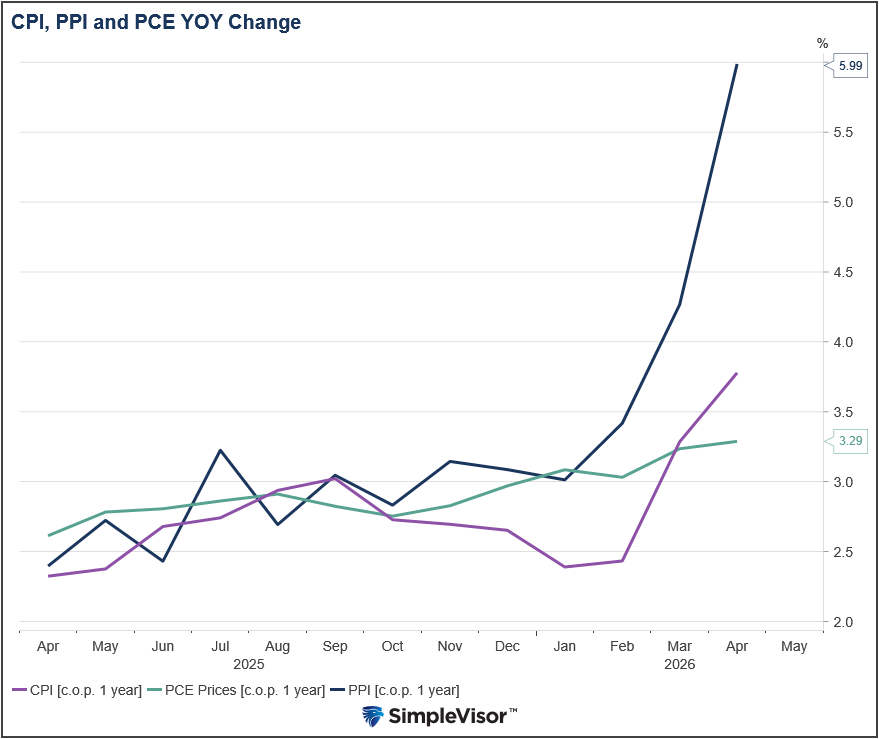
This morning, the Fed’s preferred gauge of inflation, the BEA’s PCE Price Index, showed that headline inflation rose by 0.4% and core PCE by 0.2%. Both were 0.10% below expectations. The PCE is not overly concerning, but the recent CPI data is certainly painting a more cautious picture. Understanding the differences in the calculations is important to forecast how the Fed might react to inflation.
CPI and PCE measure inflation differently in three important ways.
- Basket composition. CPI measures what consumers actually pay. PCE captures a broader universe of spending, including healthcare costs paid by employers and the government on behalf of consumers. That single difference dilutes the weight of categories consumers feel most acutely.
- Energy weighting. CPI assigns roughly 7-8% weight to energy, with gasoline alone at 3.5%. PCE energy weight sits closer to 4-5%. When oil spikes, as it has during the Iranian conflict, CPI captures the full hit to the consumer while PCE tends to understate it.
- Substitution bias. PCE assumes consumers shift behavior when prices rise, such as buying less gas, switching brands, or trading down. CPI uses a fixed basket. Thus, in a high-inflation environment, PCE should always be lower than CPI.
The calculation tends to produce a gap of 30-50 basis points between the two measures in high-oil-price environments. While the Fed closely watches PCE, the bond market tends to react more to CPI headlines. That disconnect helps explain why yields may be pricing in more sustained inflation than the Fed’s own framework actually sees. The graph below shows that PCE has had less reaction to the recent oil spike than CPI and PPI.
Tweet of the Day
New UPDATED Trading Rules With Desktop Printout
“Want to achieve better long-term success in managing your portfolio? Here are our 15-trading rules for managing market risks.”
Please subscribe to the daily commentary to receive these updates every morning before the opening bell.
If you found this blog useful, please send it to someone else, share it on social media, or contact us to set up a meeting.