Bond Outlook
This week, we will focus on the Treasury bond market.
Fundamentals
Bond yields have a very high correlation with inflation and GDP. Accordingly, bond yields tend to rise when inflation and economic growth increase. Currently, bond yields are elevated in large part due to the unusually high inflation we have experienced over the past few years. Furthermore, we would argue they are higher than they should be, given current inflation rates and inflation expectations.
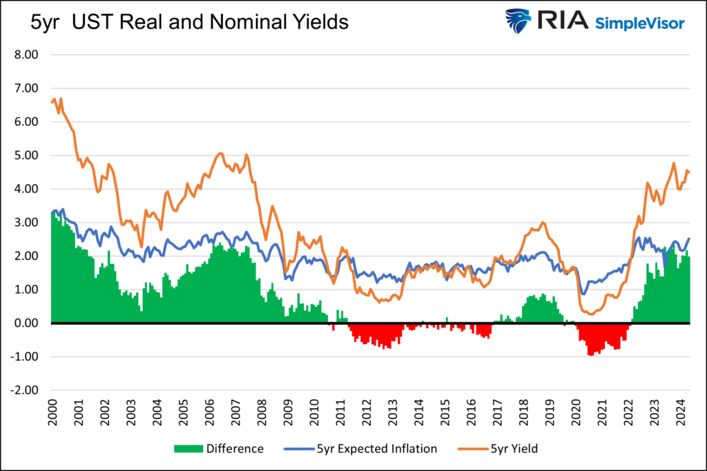
The critical question for bondholders is whether the current yield is commensurate with the actual inflation rate for the next five years. The graphs below help put this question into context.
The first graph charts five-year U.S. Treasury yields alongside the five-year expected inflation rate. Currently, five-year Treasury yields pay investors 2% more than the expected inflation rate. In the post-financial crisis era, before the pandemic, the average premium was below zero. Declining yields followed prior episodes of high real yields.

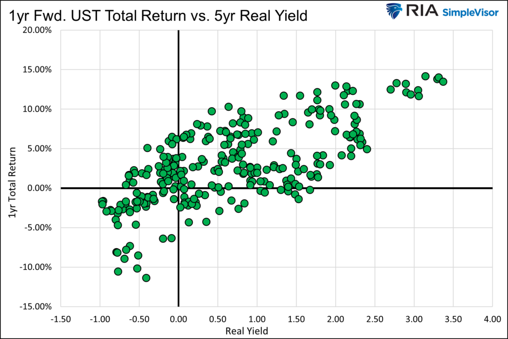
The following graph clearly shows the correlation between real yields and forward investor returns. As shown, higher real yields result in better total returns. With a real yield of approximately 2%, investors, based on the last 25 years of data, should expect a return in the five to fifteen percent range on a five-year UST bond over the next year.

A slowing economy coupled with lower inflation would undoubtedly benefit bond investors. A recession would likely drive returns to the upper end of the range.
Technicals
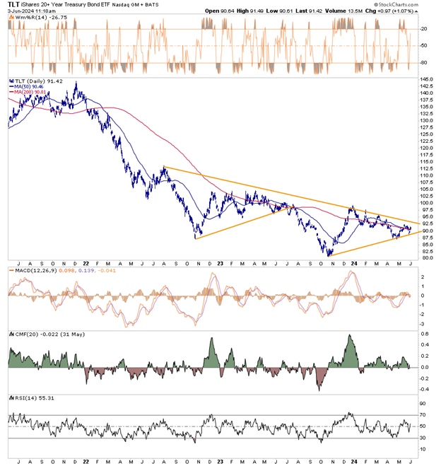
The shorter-term chart below shows the price of the 20-year bond ETF TLT has performed poorly over the last three years, commensurate with the sharp uptick in yields. The longer yellow line shows important resistance. A break above that line and a series of higher highs would bode well for TLT. TLT is forming a second wedge pattern. The first time it formed such a pattern, it ultimately resulted in TLT breaking lower. Will this time be different?
TLT is sitting on its 50 and 200-day moving averages. The averages could prove to be support or resistance.
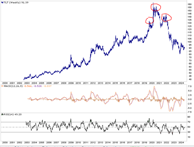
The second graph provides a longer-term view of TLT. The three circles represent a classic head-and-shoulders pattern. Based on the pattern, the price has declined more than should have been expected. Note that the MACD was extraordinarily oversold and is now near fair value. RSI also moved from very oversold levels to fair value. Both indicators have plenty of technical room for a significant move higher.


Disclosure
This report is not a recommendation to buy or sell the named securities. We intend to elicit ideas about stocks meeting specific criteria and investment themes. Please read our disclosures carefully and do your own research before investing.

Michael Lebowitz, CFA is an Investment Analyst and Portfolio Manager for RIA Advisors. specializing in macroeconomic research, valuations, asset allocation, and risk management. RIA Contributing Editor and Research Director. CFA is an Investment Analyst and Portfolio Manager; Co-founder of 720 Global Research.
Follow Michael on Twitter or go to 720global.com for more research and analysis.
Customer Relationship Summary (Form CRS)


