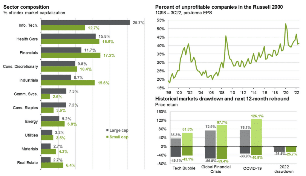
Many passive investors, such as those in retirement plans, use the start of a new year to reconsider their passive investment and reallocate accordingly. Often one of the decisions is how to split their stock allocations between large-cap and small-cap stocks. For those choosing between large-cap and small-cap stocks, we present a few graphs below to help.
The graph on the left shows large-cap stock indexes have twice the exposure to the tech sector than small-cap indexes. As a result, small-cap indexes tend to have more exposure to less volatile stocks. If you are bearish about the year ahead, this is a factor that might lead you toward small-cap stocks. However, the graph on the top right should give you some concern. It shows that over 40% of small-cap stocks are unprofitable. In our opinion, the takeaway is to be selective. If you want exposure to small-cap stocks, it’s worth looking at value-orientated funds. Lastly, the bottom right graph highlights large cap vs. small cap during the last four significant market drawdowns and their rebounds. In general, small-cap stocks tend to have more robust rebounds, yet the drawdowns are on par with large-cap indexes.
Every market cycle is different, but hopefully, this provides a little guidance for those making their 401k allocations.
What To Watch Today
Economy
- 7:30 a.m. ET: Challenger Job Cuts, year-over-year, December (416.5% prior)
- 8:15 a.m. ET: ADP Employment Change, December (150,000 expected, 127,000 prior)
- 8:30 a.m. ET: Trade Balance, November (-$63.1 billion expected, -$78.2 billion prior)
- 8:30 a.m. ET: Initial Jobless Claims, week ended Dec. 31 (225,000 expected, 225,000 prior)
- 8:30 a.m. ET: Continuing Claims, week ended Dec. 24 (1.727 million prior)
- 8:30 a.m. ET: S&P Global U.S. Services PMI, December Final (44.4 expected, 44.4 prior)
- 8:30 a.m. ET: S&P Global U.S. Composite PMI, December Final (44.6 prior)
Earnings

Market Trading Update
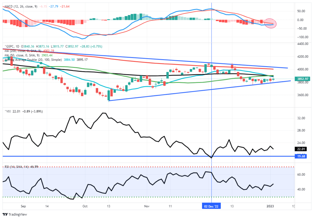
The market was finally able to pull a positive trading session yesterday. However, the overall action was disappointing, with a large surge early in the morning to only give that up mid-day. Sellers are still clearly present. Nonetheless, the markets remain in a very tight consolidation range over the last couple of weeks and may be trying to build a base here short term. With the MACD signal improving, we could see some follow-through action over the next few days.
There is a lot of resistance, as noted yesterday, where several moving averages converge. Such will present the first real obstacle for a rally over the next few trading days. Remain cautious for now. We would like to see a break above those moving averages with a bit of “bullish swagger” to make us more comfortable taking on additional short-term trading risk.
No One Has A Crystal Ball
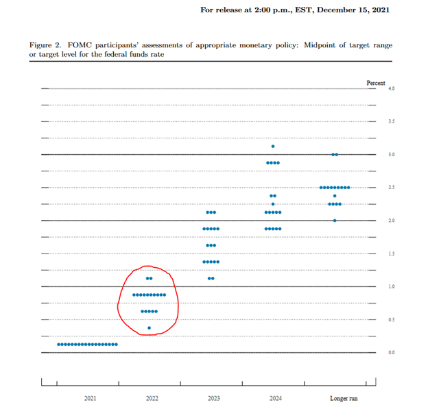
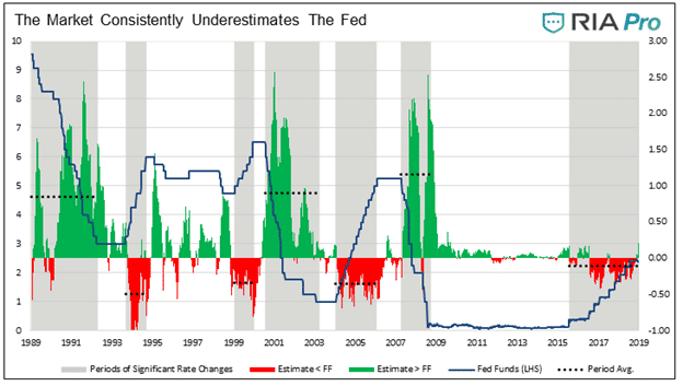
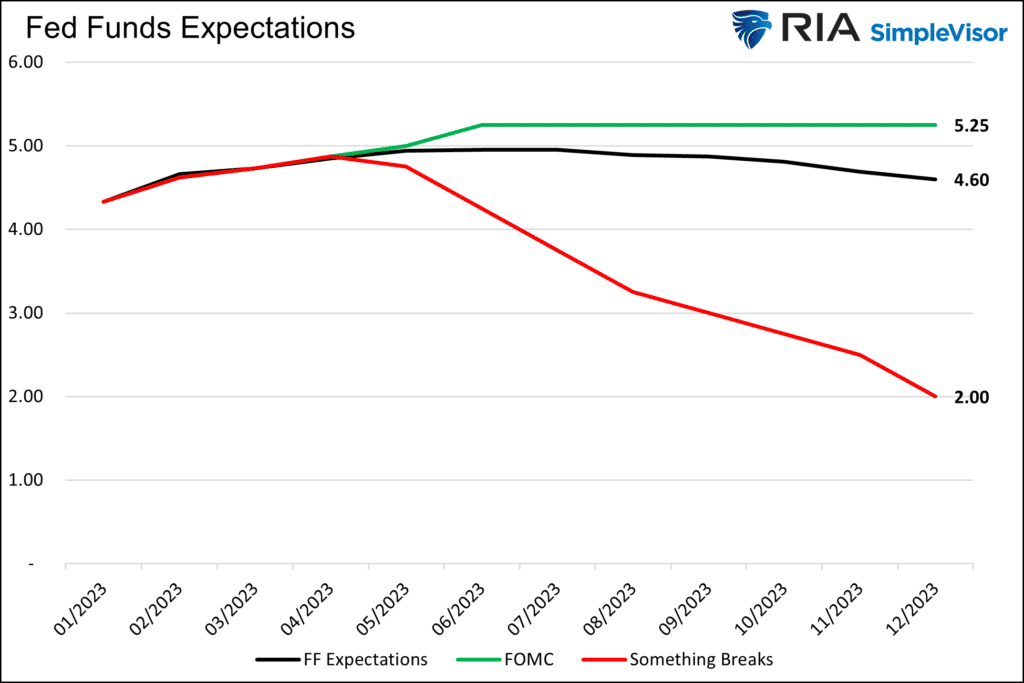
As we start a new year, it’s worth another reminder neither the Fed nor Wall Street has crystal balls. Sometimes their forecasts for the year ahead are accurate, but sometimes, often at monetary policy turning points, they are well off the mark. In Three Paths for 2023, we share the Fed and market forecasts for Fed Funds. The forecasts are slightly different, but both present a forecast with little volatility in Fed Funds. The first graph below from the article shares the Fed’s 2022 estimates from December 2021. Clearly, they were not expecting to do what they ultimately did. The following graph from Investors are Grossly Underestimating the Fed shows the market has overestimated Fed Funds by 2-2.5% when the Fed cuts rates.
We do not claim to have a crystal ball, either. That said, we do appreciate there is a good possibility for a third path, one in which “something breaks” and the Fed cuts rates significantly. Per the article:
The third path, in which the Fed aggressively lowers rates, would be a response to a significantly weakening economy, inflation falling much more rapidly than expected, or financial instability. It could also be a combination of any or all three factors.
New Highs Vs. New Lows Help Determine Bull or Bear Market Trends
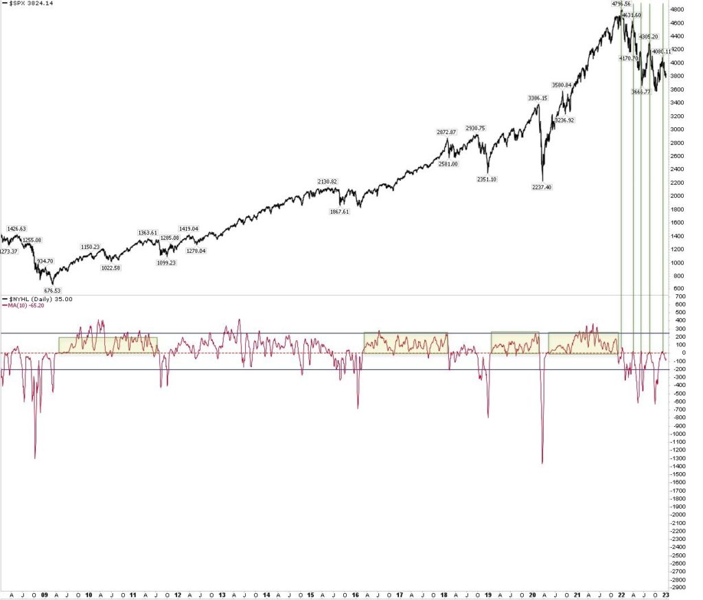
The graph below from @ukarlewitz provides a risk management tool to help us navigate the market. The S&P 500 is shown alongside the ten-day moving average of the daily sum of new 52-week highs less lows. The moving average tends to stay positive during bullish trends and negative during bearish trends. In fact, it was below zero for the entirety of 2022. Further, a local market peak was at hand every time it rose to zero.
It recently peaked and simultaneously fell from zero. Based on the graph, we should not expect a new low until the number of new lows exceeds the number of new highs by at least 300. Conversely, a break above zero may signal the bear market has ended.

JOLTs Hot ISM Not
The JOLTs employment report shows no deterioration in the labor market. Job openings were 10.45 million, slightly lower than 10.51 million from the prior month and well above expectations for a decline to 10.05 million. This precursor to Friday’s BLS labor data dump portends a relatively strong report. As we have discussed, the Fed wants the tightness in the labor market to ease to help combat inflation. The JOLTs report will only make them more anxious.
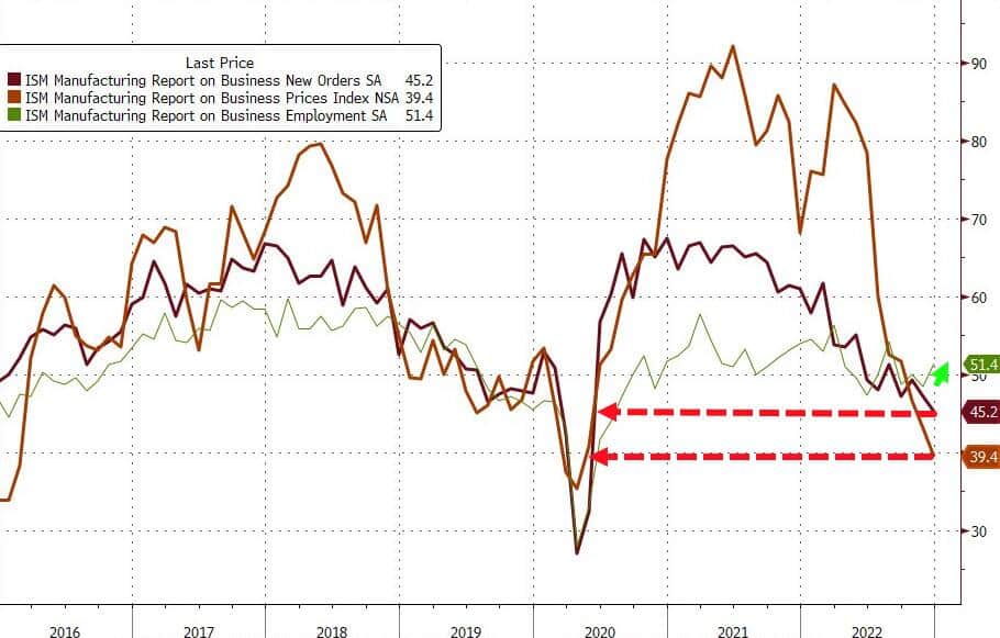
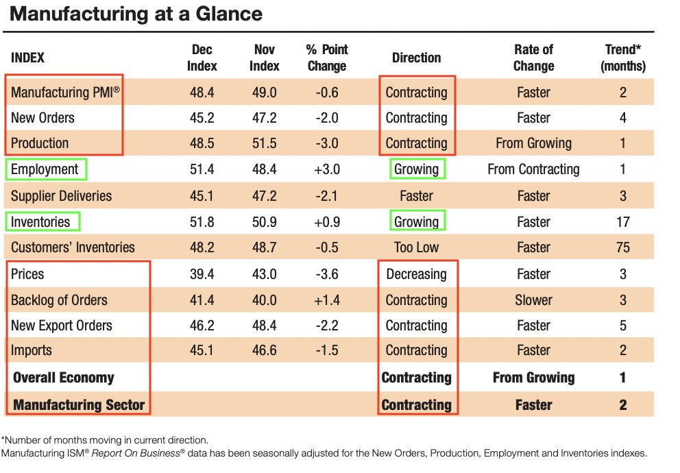
ISM fell further into economic contraction territory, but like JOLTs the employment subcomponent rose and is still in economic expansion territory (>50). However, new orders, a reliable forecaster of future economic growth, is now at the lowest level since mid-2020. The graph below from ZeroHedge shows that prices and new orders have fallen significantly and are approaching the 2020 covid lows.
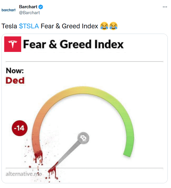
Tweet of the Day
Please subscribe to the daily commentary to receive these updates every morning before the opening bell.
If you found this blog useful, please send it to someone else, share it on social media, or contact us to set up a meeting.


