


Markets rallied late last week on headlines that a US-Iran peace agreement is close. While the politics are complicated and any potential agreement is fragile, investors should be thinking ahead. What will a peace deal, whether it’s this week or in months, mean for markets?
When the initial ceasefire was announced in April, oil prices dropped nearly 15% in a day. A confirmed agreement would likely produce a similar or larger move, possibly getting crude oil prices into the $70s or $60s if peace lasts. The Strait carried roughly 20 million barrels per day before the conflict. Even a partial resumption of flows, layered on top of the Saudi and UAE bypass pipelines and further oil reserve releases, is beneficial.
Falling oil prices then work through the inflation data with a predictable lag. A sharp oil decline in mid-June would show up partially in the June CPI report, released in mid-July, and fully in the August release. At that point, energy, which has been adding 40 basis points or more to monthly CPI prints, flips from inflationary headwind to deflationary tailwind.
Such a shift, assuming the market believes it’s durable, changes the entire rate path. The Fed’s justification for holding rates steady and the market’s growing fear of a rate hike rest almost entirely on energy-driven inflation. Accordingly, yields across the curve fall, the dollar softens, and possibly equity P/E multiples expand.
There are other factors to consider besides oil prices. As we have noted, the coming supply of IPOs and secondary offerings will generate a consistent headwind throughout this year. Moreover, the mid-term elections are likely to cause some investor trepidation as we get into the fall. That said, a lasting peace deal with Iran could provide markets with a nice tailwind to counter some of the headwinds.

What To Watch Today
Earnings
- No significant earnings reports today
Economy

Market Trading Update
On Friday, we discussed the three most significant risks to the market. However, we have previously discussed the risk of a pullback following a prolonged stretch of weekly advances. While the bulls can take last week, the 3-5% correction we discussed is now complete. The market hit support at the 50-day moving average and registered a 4.5% peak-to-trough decline. Notably, the “buy the dip” crowd showed up exactly where they were expected to.
“A normal 5% to 8% pause here only takes us back to the 50-day. That’s the level trend-followers add to, not abandon.“
The S&P probed the mid-7,200s intraday around Tuesday and Wednesday. Held, and then rallied hard Thursday and Friday to close the week at 7,431.46. That is textbook support behavior, and it keeps the larger uptrend intact above the April 2025 lows. The quality of the bounce matters too. Thursday’s 1.75% surge came on broad participation rather than a narrow handful of megacaps. That is the kind of thrust that tends to mark a low rather than a dead-cat bounce.
Momentum tells the more interesting story. The 14-day RSI sat above 70 in late May when the index printed its all-time high near 7,621. By the depths of this month’s pullback, it had fallen to roughly 41, and it closed the week back at 52.73, just above the neutral 50 line. In plain terms, the market burned off its overbought condition without breaking trend. Momentum has now turned back up, which is the healthiest way for a market to digest. MACD remains above its zero line, but the histogram rolled over during the selloff. Therefore, upside momentum is positive but no longer accelerating. Breadth is the soft spot. As of mid-week, only about 51% of S&P members traded above their own 50-day average. As has been the case, it remains a thin majority for an index sitting 2.5% below its high.
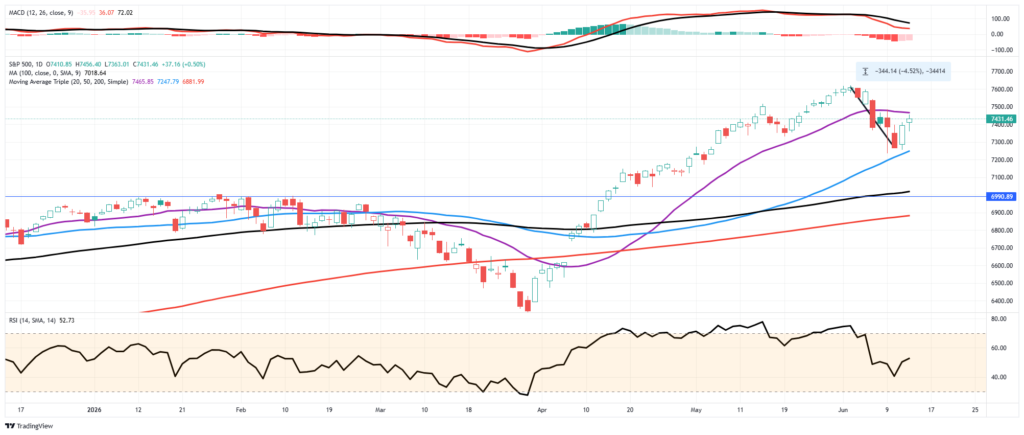
Here is the trader’s map for the week. The first hurdle overhead is the 20-DMA at 7,466, which the index is pressing right up against, then the round 7,500 level, then the prior all-time high at 7,621. Support is the line in the sand. The 50-DMA at 7,248 just proved itself, below that sits the 38.2% retracement of the March-through-June rally at 7,118, and below that the rising 200-DMA at 6,882.
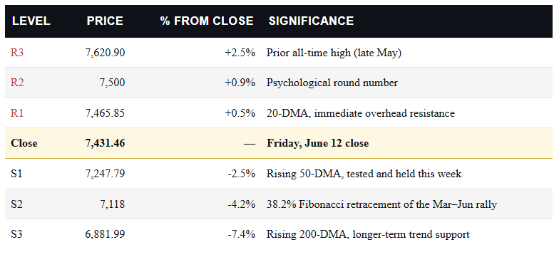
The single level I’m watching into next week is 7,248. Hold the 50-DMA through the Fed meeting, and this looks like a routine shakeout inside an uptrend, the kind of healthy pullback that resets sentiment without doing structural damage. Lose it on a hawkish surprise, and the 7,118 Fib line becomes the real test, with the 200-DMA at 6,882 as the last line of defense for the bull case. Keep trailing stops disciplined and resist the urge to chase the SpaceX-fueled enthusiasm at the highs.

The Week Ahead
Kevin Warsh will speak his first words as the new Fed Chair. We think he will try to walk a tightrope. He must acknowledge that inflation is running hotter than he would like, but at the same time note that it’s likely a temporary situation due almost entirely to the war in Iran. If there is a peace deal in place by Wednesday and oil markets reflect it, Warsh has more room to dismiss rate hikes and talk about potential cuts later this year. All of that said, the labor market, which was a primary reason to cut rates before Iran, has improved, thus he will, in some way, also discuss that the need to cut rates is not as pressing as it was earlier this year.
Lastly, Warsh believes that the productivity benefits of AI are disinflationary. He will likely weave that view into any discussion of longer-term monetary policy strategies.
Retail sales have been strong despite repeated warnings from major retailers. The current estimate for Wendeday’s report is for an increase of +0.6%, which is positive after accounting for inflation. A weaker-than-expected number should not be a surprise.
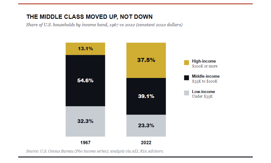
The K-Shaped Economy: Why The Middle Class Moved Up
The K-shaped economy has become shorthand for a tidy story. The rich pull away while everyone else falls behind. It fits the mood, and it makes for a sharp headline. The problem is that it’s mostly wrong. When you pull the actual Census data, the dominant move of the last half-century isn’t down. It’s up. Yes, the middle class is shrinking. But it’s shrinking because millions of households climbed into higher brackets, not because they slid into poverty. The real divide lies elsewhere, and most of the coverage walks right past it.
Let’s start with what the term “K-shaped” means, because the label gets stretched to cover almost everything. A K-shaped economy is one where different parts move in opposite directions at the same time. One arm rises with high incomes, corporate profits, and asset values. The other arm stalls with low-wage work, thin savings, and shuttered small businesses. The phrase caught fire after the 2020 shutdown, when high-skill workers shifted to remote work while service jobs vanished overnight.
As a description of that moment, it was accurate. The shutdown hit restaurants, travel, and personal services hardest, and those jobs are inherently lower-wage. Meanwhile, technology, finance, and professional services barely missed a beat. So far, so good. The trouble starts when the K gets applied to the entire arc of American incomes over the last five decades. That’s where the story breaks down.

Tweet of the Day
New UPDATED Trading Rules With Desktop Printout
“Want to achieve better long-term success in managing your portfolio? Here are our 15-trading rules for managing market risks.”
Please subscribe to the daily commentary to receive these updates every morning before the opening bell.
If you found this blog useful, please send it to someone else, share it on social media, or contact us to set up a meeting.