


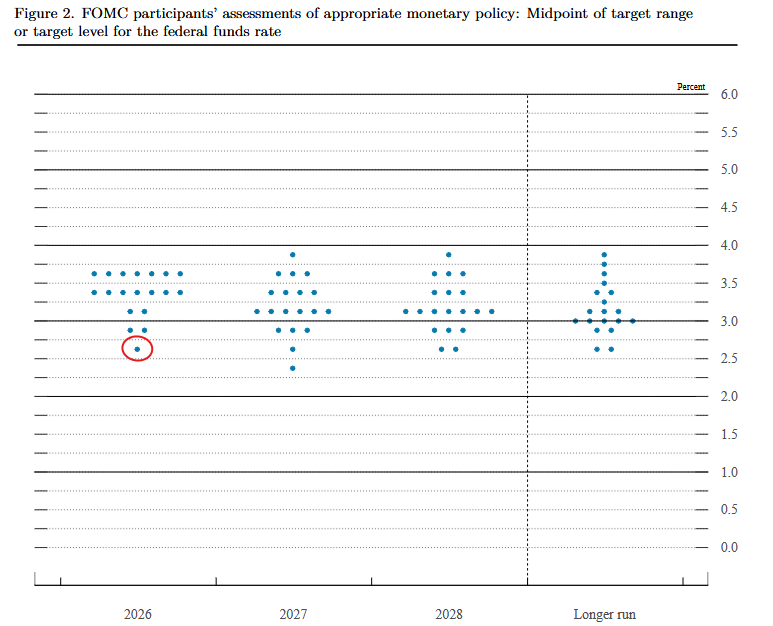
Jerome Powell’s term as Fed Chairman expires this Friday, with Kevin Warsh now confirmed by the Senate as his successor. The transition has implications beyond a change in the Fed’s leadership. Further, Stephen Miran, who was appointed Fed Governor in September 2025 to fill the vacancy left by Adriana Kugler, is seeing his term come to an end. Most noteworthy during his term, he dissented at all six FOMC meetings he attended, consistently pushing for 50-basis-point rate cuts. It’s not a stretch to say he was the Fed’s biggest dove. In the graphic below, we circle Miran’s year-end Fed Funds projection in the latest Fed’s dot plot. As shown, Miran projected a year-end 2026 Fed Funds rate of 2.625%, nearly a full percentage point below the current median of 3.42%. That dovish voice is now gone.
Warsh’s arrival shifts the balance. Here are a few considerations worth keeping in mind:
- The Fed tilted slightly more hawkishly: Warsh may prove more dovish than his reputation suggests, but it is nearly impossible he will match Miran’s appetite for cuts.
- The next FOMC meeting on June 17th is unlikely to produce action. Given recent inflation data, we see little appetite for rate cuts at the next FOMC meeting despite new leadership.
- Powell isn’t gone. He has pledged to remain a Fed Governor through January 2028, or until ongoing investigations into the Fed’s construction project and legal challenges against Governor Lisa Cook reach what he calls “transparency and finality.”
The bottom line: The Fed just got incrementally more hawkish, and the June meeting will be the first test of what that actually means. Moreover, Kevin Warsh will now be on the speaking circuit, so we can better ascertain his thoughts on inflation, employment, and how he will lead the Fed going forward.
What To Watch Today
Earnings
- No significant releases today
Economy

Market Trading Update
Yesterday, we touched on the erratic rotations between value and growth this week. Today, I want to tie together a couple of things we have touched on this week.
Simon White at Bloomberg dropped a striking chart this week. Putting realized correlation, dispersion, and gamma on a single 3D grid back to 2014, he found that correlation has never been this low while both dispersion and gamma sit this high. The only comparable peak? Late 2021. Right before things got interesting.
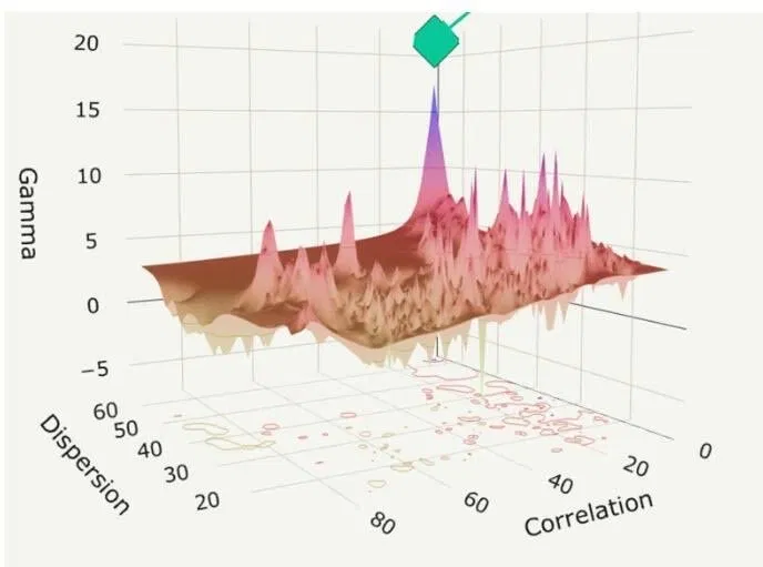
That’s not a coincidence. It’s a structural warning about how this rally has been built.
Here’s the problem with the move off the March lows. It hasn’t been driven by spot buying. It’s been driven by dealers hedging short-gamma exposure, pension rebalancing flows, and systematic strategies chasing the trend higher. When realized correlation drops while dispersion climbs, that’s the textbook signature of a market moving on options-driven mechanics rather than conviction.
Think of it this way. Real demand pulls everything up together. Mechanical demand lifts the indices while individual names scatter. The tape looks healthy on the surface. Underneath, the buying isn’t sticky.
The peers in the six-week streak club tell the story. April 2009 (the post-GFC bottom), December 1962 (Cuban Missile Crisis recovery), June 1997, and December 1985. Every one of those moments followed a violent dislocation, and every one came with policy support pouring in behind it. This time, the policy backdrop isn’t QE1. It’s a Fed still talking about restrictive territory while the front-end prices are cut.
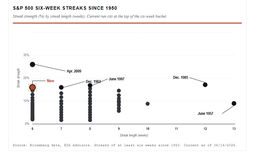
The gamma squeeze that drove this rally can flip either way. As options expire or get rolled, dealer hedging flows reverse. If breadth stays narrow and spot buyers don’t show up to absorb the supply, any mean reversion gets dynamic in a hurry. We’ve watched that playbook before, in late 2018 and again in early 2022. The setup rhymes.
That doesn’t mean exit the rally. It means respect what’s holding it up.
In our portfolios, we’re trimming winners that have outrun their fundamentals, raising stop levels under leadership names, and rebalancing equity weights back toward target. We will also extend the duration modestly if needed. If the air pocket comes, bonds remain the historical stabilizer for a balanced book, even at current yields.
On the hedging side, the cost of protection has actually compressed during this melt-up, which is unusual. Long-dated puts are cheaper than they should be, given the structural risk picture. That’s an asymmetry worth pricing into the book if you are so inclined.
Bottom line: This is not the moment to chase. It’s the moment to harvest gains, tighten risk, and let the next setup come to you.

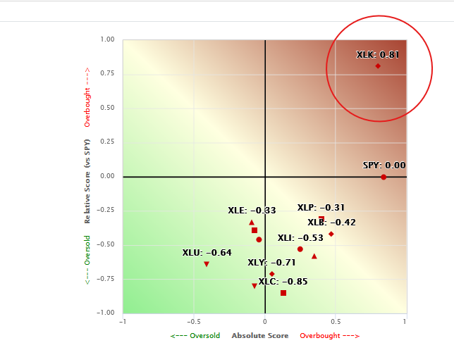
Absolute And Relative Analysis Signal Fragility
It is no secret that technology stocks, and within the technology sector, semiconductor and hardware stocks, are grossly outperforming the market. The first graph below, courtesy of SimpleVisor, shows how overbought technology (XLK) is, both in absolute and relative terms. Most often, such a wide divergence in technical scores between sectors signals that a rotation is likely. The question we should then ask is what might be in favor if technology is going to lose some momentum. This is where looking at both absolute and relative scores can be very helpful.
The answer to our question of which sector(s) are next to outperform the market is likely among the many underperformers. Let’s turn our attention to the second graphic. Instead of sectors, it uses stock factors to assess how different types/styles of stocks are trading. The relative scores show that plenty of factors are decently or even grossly oversold relative to the market. But the absolute scores show that many of the relatively oversold sectors are overbought to varying degrees. For example, we highlight the large-cap value sector, which is decently overbought on an absolute basis despite being relatively oversold. Accordingly, a rotation could likely mean relative outperformance of value, low-beta, and generally more conservative stocks versus technology and high-beta stocks, but this could occur during a broad-based market decline, bringing absolute scores for many factors and sectors closer to fair value.
It’s also worth noting that the dispersion of the dots in both graphics indicates poor breadth. While not a recipe for decline, it does point to fragile conditions. Taken together, the analysis raises concerns that the market will decline in the coming weeks, with technology stocks possibly leading the way lower and value stocks outperforming but still declining.

Muni Junk Ignores The Headlines
The private credit markets are hitting turbulence, leaving some investors clamoring to reduce exposure to junk debt. On top of fear in the private credit markets, energy prices are high, consumer sentiment is poor, and interest rates are rising. However, the City of Houston had no problems selling a junk-rated municipal bond. Issued by the City of Houston and George Bush Intercontinental Airport, the BB+- rated debt offering is secured by rent payments from United Airlines.
Considering that airlines are struggling due to high fuel costs, which is forcing them to raise ticket prices, and the recent bankruptcy of Spirit Airlines, this deal tells us a lot about where investor appetite stands for high-yield debt. Simply, the demand for higher-yielding securities is overriding headline risk.
Tweet of the Day
“Want to achieve better long-term success in managing your portfolio? Here are our 15-trading rules for managing market risks.”
Please subscribe to the daily commentary to receive these updates every morning before the opening bell.
If you found this blog useful, please send it to someone else, share it on social media, or contact us to set up a meeting.