


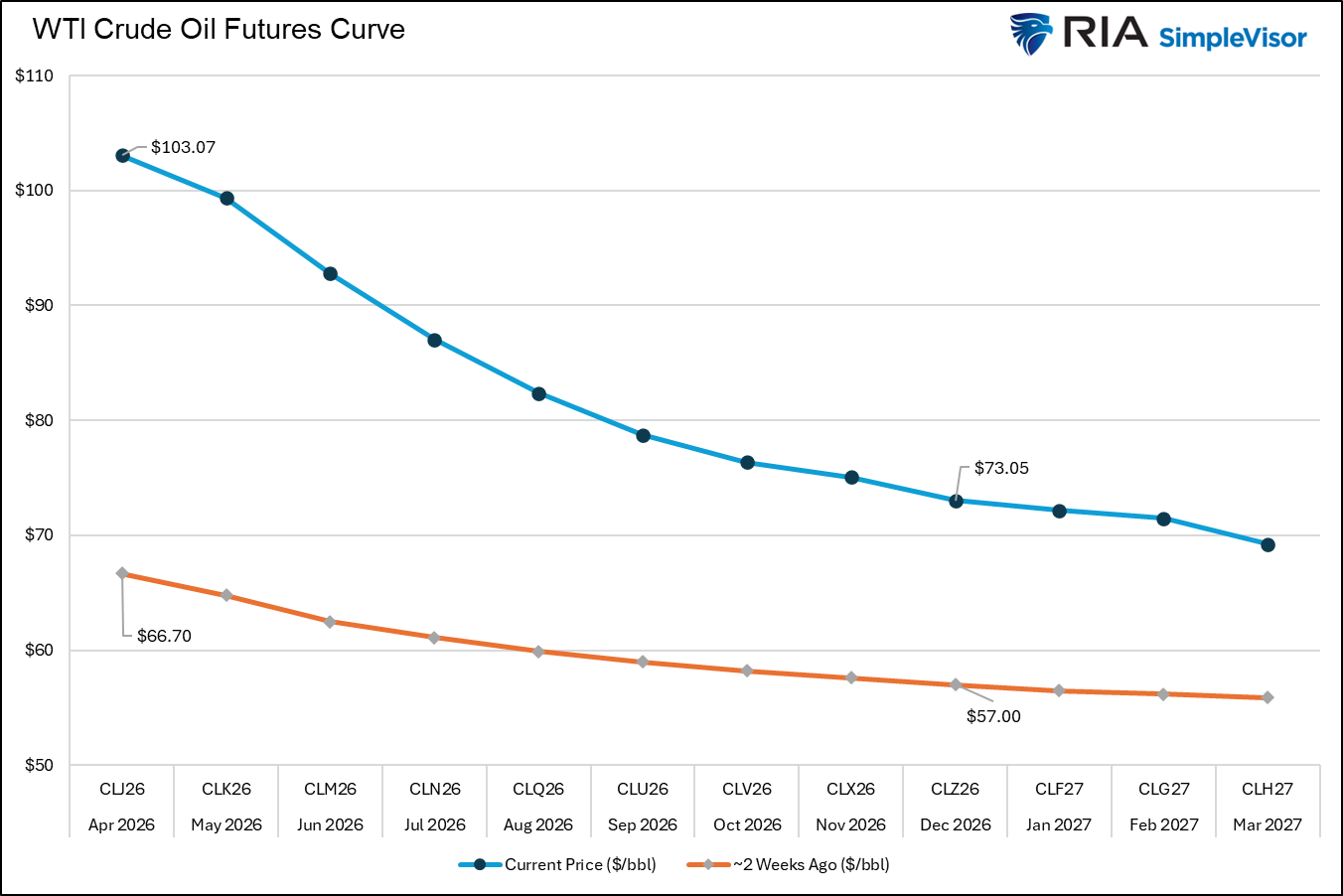
Rather than relying on Wall Street forecasts, scary headlines, and fear-mongering social media posts, the oil futures curve provides the collective judgment of future oil prices from the most informed and financially committed market participants — traders, producers, refiners, and hedgers.
Oil, like most commodities, trades in a series of contracts based on future delivery dates. The prices for each of these monthly delivery dates form what’s called the oil curve. When the shape of the curve is in contango (futures prices are higher than the current price), it indicates the market expects oil to be more expensive in the future. This may be due to anticipated supply constraints, rising demand, or expected changes in storage costs. Other times, like today, when the oil curve is in backwardation (spot prices are higher than futures prices), the market signals that current elevated prices are a temporary phenomenon rather than a structural shift.
In the context of the current Iran conflict, the oil curve is signaling that the short-term spike is unlikely to last. That said, it forecasts the conflict will result in elevated prices throughout this year. The graph below shows that the front contract (April) is priced at $103 a barrel, while the year-end December contract is $30 lower at $73. However, as shown, the December contract is up by about $16 since the conflict started. In short, the oil curve is signaling that the surge over $100 is temporary, but over the course of the year, oil prices could be decently higher than expected before the conflict.
What To Watch Today
Earnings
Economy
Market Trading Update
Yesterday, we provided the technical backdrop for the market. We did a much deeper dive in Technical Deterioration: Risk Management Is Key as well, and discussed the technical levels to watch. To wit, the technical deterioration is now the story, and risk management is the only rational response.

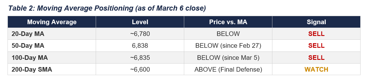
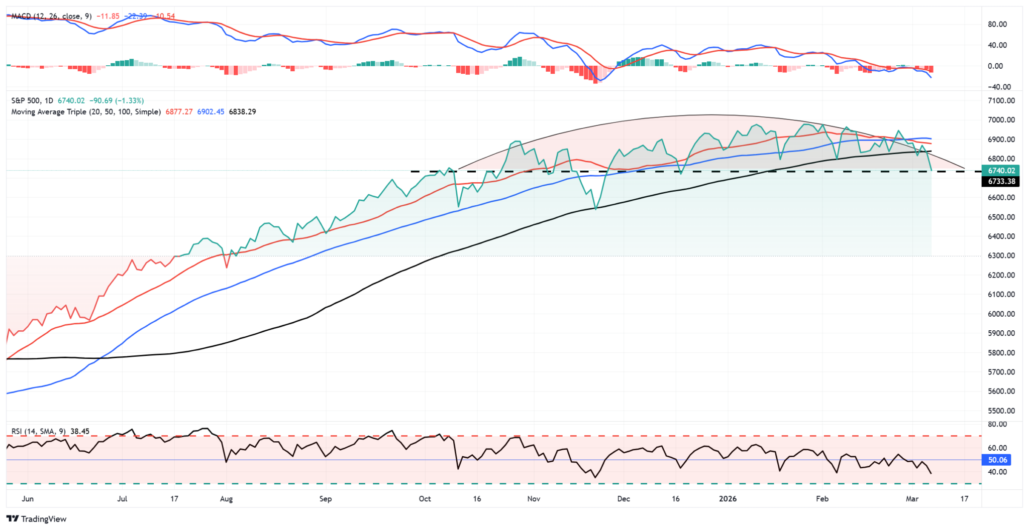
“The most critical development is the systematic breakdown of every short-term moving average. The S&P 500 has been trading below its 50-day moving average at 6,838 since February 27. On March 5, it cracked the 100-day moving average near 6,835. Friday’s close at 6,740 now places the index roughly 100 points below that entire cluster. With the broken averages now converting from support to resistance. Of the 12 moving average signals we track, 10 are on a sell signal. A degree of alignment that does not occur in routine corrections.
“The 20-day moving average has also crossed below the 50-day. The “death cross” adds additional resistance and increases selling pressure on rallies. As Pink Floyd notes, it’s “another brick in the wall” of the deterioration since the market’s high of 7,002″
Yesterday, as oil initially spiked above $100, the market reversal continued at the open. Notably, the market sold off toward the 200-day moving average and was sufficiently oversold for a technical, reflexive bounce. As shown, with the market more than 3 standard deviations below its 50-dma, relative strength approaching 30, and momentum reversing sharply, the bounce was not unexpected.
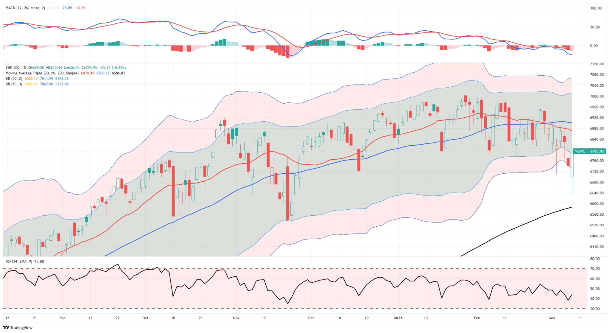
However, many long positions are trapped in the recent sell-off, so any rally in the coming days will likely be an opportunity to temporarily reduce exposure until the “fog of war” clears somewhat. As we noted in yesterday’s post, full link below, raising cash levels temporarily is likely prudent.
“The tactical playbook is clear. Any relief rally into the 6,830–6,850 zone, where the broken 100-day and 50-day moving averages should now act as resistance, presents an opportunity to initiate hedges or reduce long exposure, with a stop at 6,960 above the prior Point of Control.
For long-only portfolios, raising cash to 10–15% of the portfolio and increasing short-term bond holdings can provide a decent hedge against further volatility. However, be patient before becoming overly defensive, as the market is already short-term oversold enough to support a reflexive rally.”
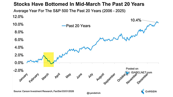
These are our best thoughts for now, and obviously, we will continue to update you as we progress forward. The good news is that this sell-off aligns with statistical norms for February and March, and the middle of March tends to find broader support for stocks in mid-term election years.

Large Cap Growth Is Back
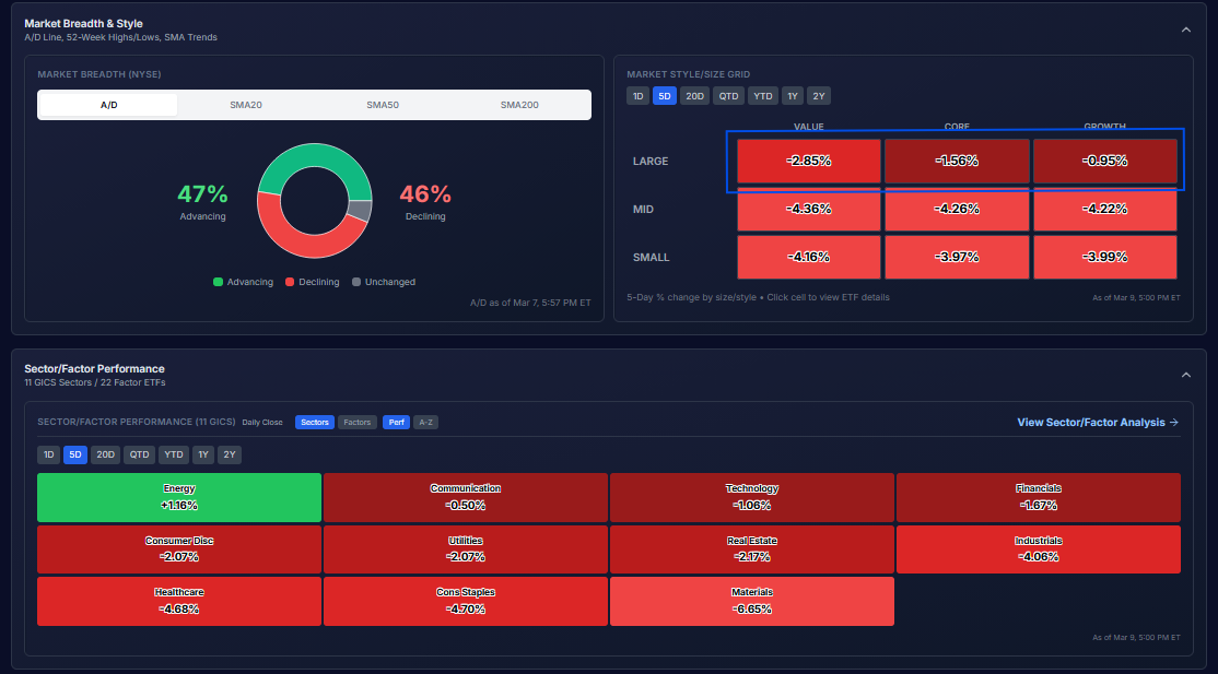
Amid last week’s decline, large-cap growth stocks handily outperformed all other combinations of market cap and growth/value. The first graphic below is from our new SimpleVisor in development. We hope to release this enhanced version over the coming months. As shown in the top-right corner, large-cap growth stocks were down just shy of 1%. Such was better than core and value large-cap growth, and further, it handily outperformed the six boxes below it, representing growth and value, mid- and small-cap stocks.
That first paragraph, saying large-cap growth outperformed, may sound odd, as those stocks were lower on the week. However, the key to rotation analysis is not a forecast of market direction but rather an assessment of which sectors, factors, and stocks are outperforming or underperforming the market. The table at the bottom of the first graphic shows that the sectors most overbought before the Iran conflict, like minerals and staples, were among the week’s biggest losers. Given that these conservative sectors fell by the most last week, this points to their high degree of overboughtness, as we warned over the prior few weeks.
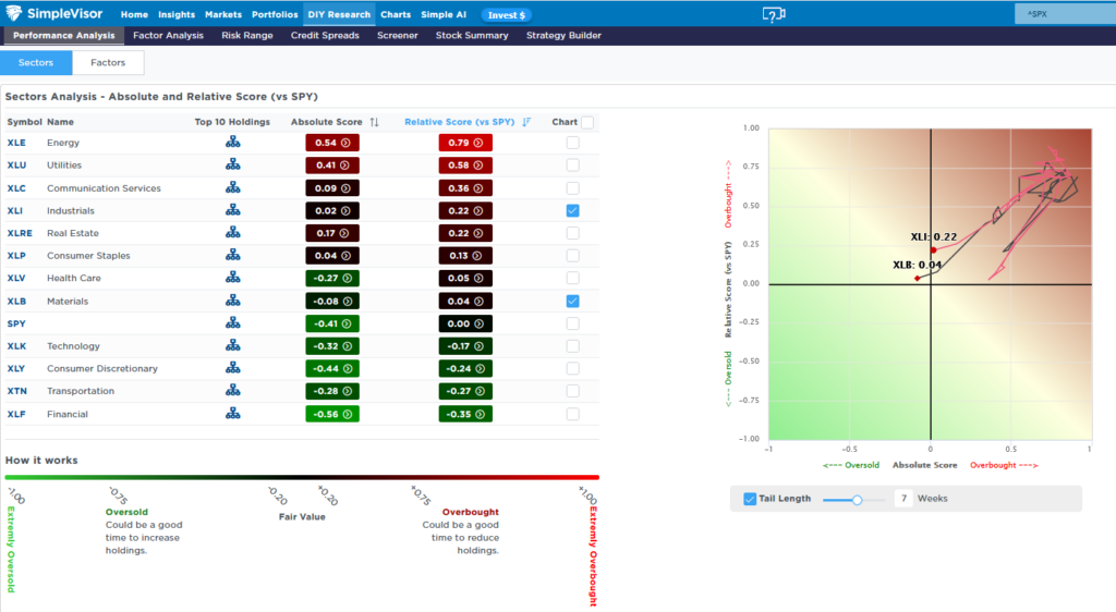
The second graphic from the current SimpleVisor shows how materials and industrials rose to being very overbought on an absolute and relative basis, but over the last week fell quickly to fair value.
Technical Deterioration: Risk Management Is Key
The S&P 500 closed at 6,740 on Friday, its lowest level since mid-December, as technical deterioration, collapsing payrolls, and $90 oil converged on the charts. Every major moving average has broken. Here’s what comes next.
The S&P 500 closed at 6,740.02 on Friday, down 90.69 points or 1.33%, capping a week that delivered the index’s worst performance since mid-October and its lowest closing level since mid-December. The technical deterioration that had been building beneath the surface for weeks is now impossible to ignore. With the Dow off 453 points, the Nasdaq down 1.59%, the Russell 2000 shedding 2.33%, and the VIX surging 24% to close at 29.49, Friday’s session carried the unmistakable signature of institutional distribution, not a garden-variety pullback. But the headline risk merely accelerated a breakdown we have discussed over the last few weeks.
“Technically, the market looks weak, as shown in the chart below. Momentum continues to fade along with Relative Strength. Furthermore, the market has been making lower highs as of late and is threatening to break important support at the 100-day moving average.”
Chart updated through Friday.
Tweet of the Day

“Want to achieve better long-term success in managing your portfolio? Here are our 15-trading rules for managing market risks.”
Please subscribe to the daily commentary to receive these updates every morning before the opening bell.
If you found this blog useful, please send it to someone else, share it on social media, or contact us to set up a meeting.