


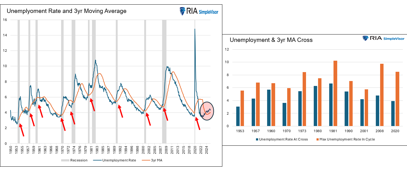
Albert Edwards from Societe Generale posted a graph similar to the one on the left below. It tracks the unemployment rate and its 3-year moving average. The red arrows signify every time the unemployment rate rose above the moving average. As we circle, the unemployment rate is now above the moving average. Albert’s comment alongside his graph is as follows:
No-one is predicting a US recession in 2026 despite this simple indicator having a 100% track record of success. This time may well be different, but you’ve got to have a bloody good reason to ignore this. Are you feeling confident?
Given that the unemployment rate is again above its 3-year moving average, we must raise concerns that this indicator, with its “100% track record,” is signalling a recession. This time may be different, as Edwards alludes, but if it’s not, here are some statistics on the prior instances to help us appreciate what might occur:
- On average, the unemployment rate rose by 2.60% after crossing its moving average. The minimum increase, in 1960, was 1.00%. The bar chart on the right shows each instance.
- In every instance prior to the current one, the recession began at the time of the crossing or earlier. As we circle below, the most recent cross occurred in June 2024. In other words its been over a year and a half since it crossed. Might this time be different?
What To Watch Today
Earnings

Economy
Market Trading Update
Yesterday, we discussed the potential for an oil price reversion, which would have a significant impact on energy stocks. Of course, in the middle of a bullish surge, it is hard to imagine a reversal. However, historically, it has always done so. Today, we will dig into that risk a bit more deeply.
Every oil price spike generates the same reflexive trade. Retail investors pile into XLE, chasing momentum and convinced the energy supercycle has finally arrived. History has a different opinion. Across the four major WTI oil price peaks since 2008, XLE has declined at every measurable horizon following the top. The losses aren’t random; they follow a predictable pattern, and understanding that pattern is essential right now, given the oil volatility tied to the U.S.-Iran conflict.
The four peaks in focus are July 2008 ($147/bbl), April 2011 ($113/bbl), June 2014 ($107/bbl), and June 2022 ($122/bbl). Each one arrived with its own macro catalyst — commodity supercycle euphoria, Arab Spring disruption, Libyan output fears, and Russia’s invasion of Ukraine, respectively. And each one was followed by meaningful deterioration in XLE, regardless of the narrative driving the spike.
The 2008 episode was the most severe. XLE lost roughly 46% in just three months as the financial crisis cascaded through every risk asset. But even in the “milder” 2011 cycle, energy stocks shed 29% over six months as demand destruction from a slowing global economy quietly drained the commodity’s momentum. The 2014 collapse was a different animal entirely — a slow-motion repricing driven by the shale supply glut — and XLE was down 34% by December of that year. The 2022 episode produced the quickest partial recovery, with XLE giving back only 5% at the six-month mark, aided by OPEC+ production discipline and persistent institutional buying.
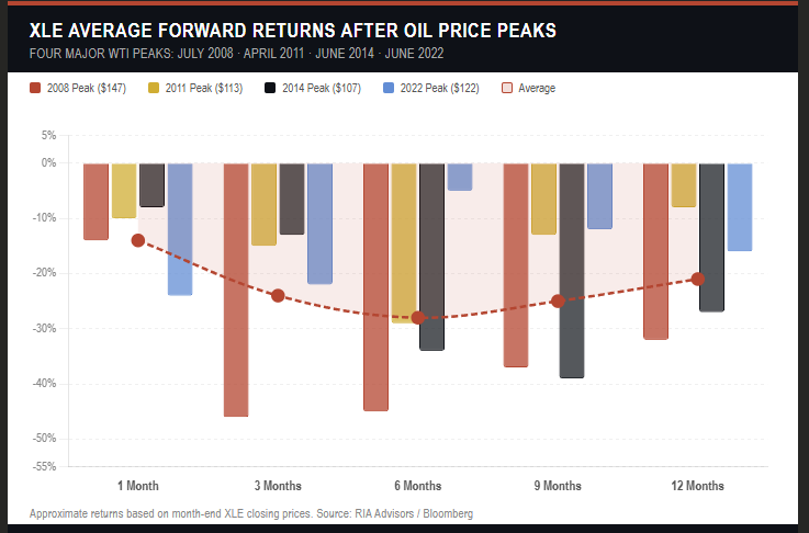
The average across all four peaks tells the story cleanly. XLE loses roughly 14% in the first month following an oil price top, deteriorates to nearly 28% below peak by six months, and then stages a partial recovery to close down around 21% at the 12-month mark. The six-month window is consistently the worst entry point for anyone who chased the commodity spike.
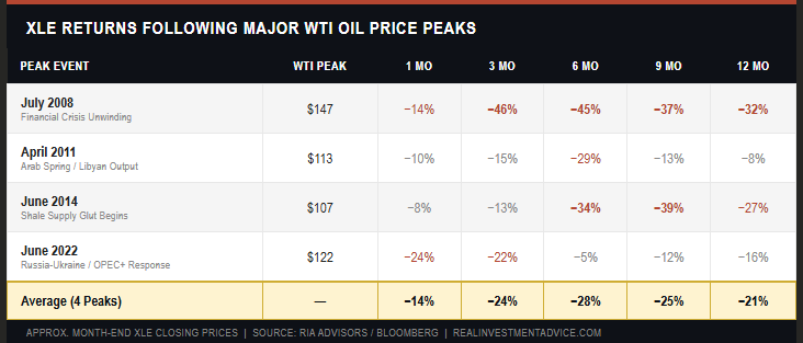
Why does this pattern repeat? Oil price peaks almost always coincide with peak demand expectations, which are a leading indicator of economic deceleration. When crude tops out, the market quickly begins pricing in the consumer-spending squeeze that high energy costs produce. Energy companies, even the best-capitalized ones in the XLE basket, face margin pressure, capital allocation constraints, and, eventually, earnings revisions. The commodity and the equity don’t diverge indefinitely, particularly when the earnings are derived from the underlying commodity.
Currently, investors are paying a significant premium for energy stocks versus the revenue generated by the underlying commodity.
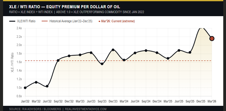
As the old saying goes, “The cure for high prices is high prices.” This time will likely not prove different, so don’t forget to take profits ahead of time.

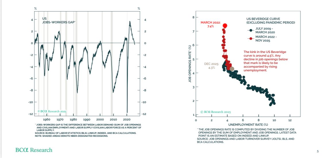
More Concerning Labor Indicators
The graphs below are courtesy of Peter Brerezin of BCA Research. The graph on the left shows that the job openings-to-worker ratio has turned negative. This indicates that more people are seeking jobs than there are job openings. On its own, that graph is not overly concerning, as it is most often negative, even during periods of strong economic activity. However, the graph on the right, showing that once the job openings rate falls below 4.5%, the unemployment rate starts rising, is worrisome. Continued declines in job openings, according to the BLS JOLTS report, could push the unemployment rate higher and the economy into a recession.
Will AI Trigger The Next Great Depression?
Our article title is certainly scary. The question we pose has become a hot topic following the release of “The 2028 Global Intelligence Crisis,” by Citrini Research.
While evaluating the impact of AI on the labor market is complex, we can distill both optimistic and pessimistic views into two straightforward questions.
- Will AI bring about an era of unmatched prosperity and productivity, freeing workers from monotonous tasks, revitalizing old industries, and creating new and unimaginable ones?
- Or will AI displace many white-collar workers faster than the economy can absorb them, triggering a deflationary spiral with consequences that rival the Great Financial Crisis or worse, the Great Depression?
To better understand how AI might affect the labor market and, ultimately, the economy, we review the bleak Citrini article alongside more optimistic rebuttals from Citadel Securities and Bianco Research. The articles and our summaries provide a useful primer on how the labor markets may adjust to the upcoming major technological changes.
Tweet of the Day
“Want to achieve better long-term success in managing your portfolio? Here are our 15-trading rules for managing market risks.”
Please subscribe to the daily commentary to receive these updates every morning before the opening bell.
If you found this blog useful, please send it to someone else, share it on social media, or contact us to set up a meeting.