


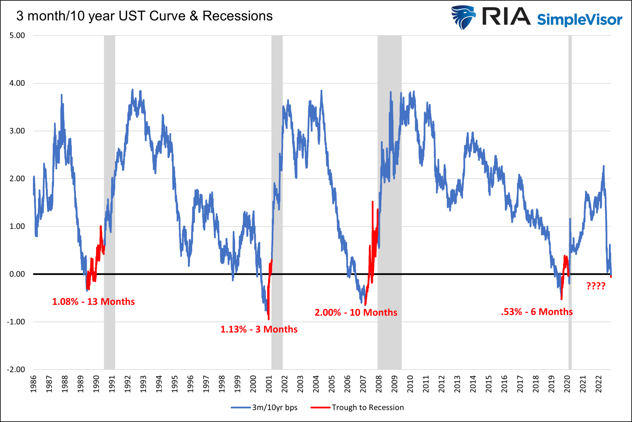
Q3 GDP rose nicely, but the Fed’s preferred yield curve has spoken. It says a recession is imminent. The graph below charts the yield difference between the 3-month Treasury bill and the 10-year Treasury note. The Fed often reminds us that an inversion in the 3m/10yr UST curve is a precursor for recessions. Every time, as we annotate in red, the ten yield is lower than the three-month yield for more than a few days, a recession follows.
When should we expect a recession? As the graph highlights, it has taken between three and thirteen months from the trough of the yield curve inversion until the official NBER recession declaration. Making timing a little tricky is the clock doesn’t start ticking until the yield curve troughs. Based on Fed Funds futures, we expect the three-month yield will rise from 4.05% to 4.80%. Unless the 10-year yield falls by .75% over the coming months, the Fed’s yield curve will invert further. Such a trough in the Fed’s yield curve may take another couple of months to form. Then we can start the recession clock.

What To Watch Today
Economy
- 8:30 a.m. ET: Employment Cost Index, 3Q (1.2% expected, 1.3% prior)
- 8:30 a.m. ET: Personal Income, month-over-month, September (0.4% expected, 0.3% prior)
- 8:30 a.m. ET: Personal Spending, month-over-month, September (0.4% expected, 0.4% prior)
- 8:30 a.m. ET: Real Personal Spending, month-over-month, September (0.2% expected, 0.1% prior)
- 8:30 a.m. ET: PCE Deflator, month-over-month, September (0.3% expected, 0.3% prior)
- 8:30 a.m. ET: PCE Deflator, year-over-year, September (6.3% expected, 6.2% prior)
- 8:30 a.m. ET: PCE Core Deflator, month-over-month, September (0.5% expected, 0.6% prior)
- 10:00 a.m. ET: Pending Home Sales, month-over-month, September (-5.2% expected, -2.0% prior)
- 10:00 a.m. ET: Pending Home Sales NSA, year-over-year, September (-22.5% prior)
- 10:00 a.m. ET: University of Michigan Consumer Sentiment, October final (59.6 expected, 59.8 prior)
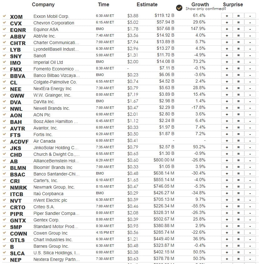
Earnings
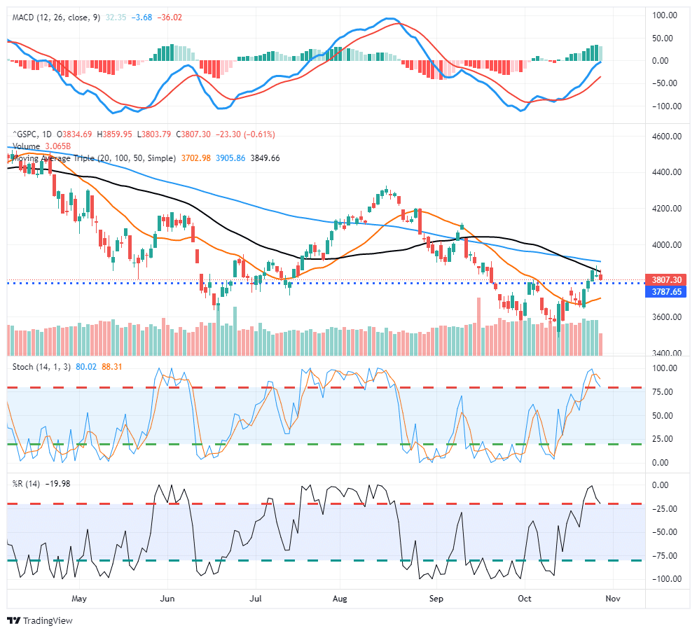
Market Trading Update
Another tough day of trading yesterday as Facebook’s massive disappointment sent the stock plunging to the lowest levels in several years, closing below $100/share. After the close, Amazon disappointed as well, another Megacap name that will weigh on the S&P 500 today. While reporting some weaknesses in product sales, Apple did better and may provide some support.
The market did manage to hold onto the 3800 level, but unless the markets can muster a rally, that support is now at risk of getting broken today. If it does, the 20-dma remains the last support level before a retest of lows. If that does become the case, the risk to the downside increases markedly. We are starting to reduce risk in portfolios further today and raising additional cash for the time being. Once markets stabilize we will look to rebuild allocations accordingly.
GDP Oddities
GDP was stronger than expected, growing at 2.6%. Growth is now positive for the year, after -.6% and -1.6% GDP in the second and first quarters, respectively. The table below from Charles Schwab breaks down GDP into its components.
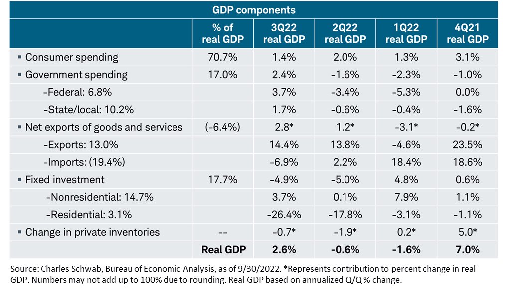
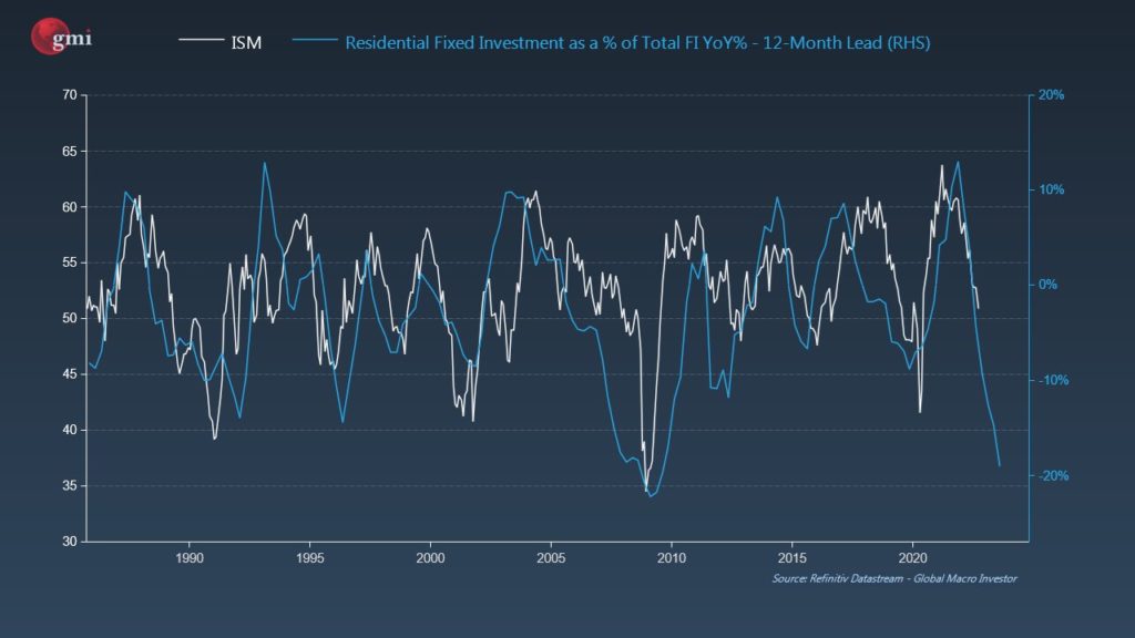
There are two extreme readings within the report worth noting. First, fixed investment, accounting for about 18% of GDP, detracted from growth. The decline was due to a sharp fall in investment in residential housing. In fact, residential investment single handily reduced GDP by 1.4%, the largest negative contribution since 2007. Given high mortgage rates and plummeting homebuilder sentiment, this was expected. The concern, however, is that residential fixed investment (RFI) tends to lead the economy by about a year. The graph below shows the strong leading relationship between RFI and ISM.
The second outlier is foreign trade. Net exports (exports minus imports) are often a negative component of GDP as America runs a perpetual trade deficit. However, in the third quarter, exports handily outstripped imports adding 2.8% to GDP growth, accounting for its largest contribution to GDP in over 40 years. This is somewhat surprising, given a strong dollar favors imports. Looking into the data, we find exports were led higher by “petroleum and products.” We think increased natural gas needs from Europe, along with higher energy prices, are the likely culprit.
The GDP price index was +4.1%. While high, it is a welcome sign inflationary pressures are easing. The Q2 price index was +9.1%.
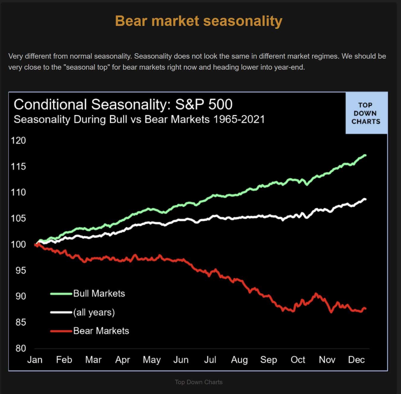
Seasonality in a Bear vs. Bull Market
The graph below, from Top Down Charts, sheds new and concerning light on seasonality patterns for the S&P 500. As it shows, markets tend to go higher in the fourth quarter. However, in bear markets, October’s tend to have decent gains but said gains are often erased in November or December.
Larger Federal Deficits
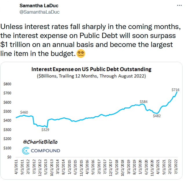
The Tweet below from Samantha LaDuc shows how the surge in interest rates is pushing the interest expense for the U.S. Treasury higher. To put $716 billion, and rising, into perspective, the entire deficit for 2019 was just under $1 trillion. From 2013 to 2017, the entire deficit was less than $716 billion. This is yet another reason that higher interest rates are not sustainable.
Tweet of the Day

Please subscribe to the daily commentary to receive these updates every morning before the opening bell.
If you found this blog useful, please send it to someone else, share it on social media, or contact us to set up a meeting.